I’m not going to lie. I set out to describe Pantone’s color of the year and after about 5 tries, I realized my feeble attempts came nowhere close to their explanation. And so, I present to you: Pantone’s description straight from their website.
“Pantone’s Color of the Year, Viva Magenta 18-1750, vibrates with vim and vigor. It is a shade rooted in nature descending from the red family and expressive of a new signal of strength. Viva Magenta is brave and fearless, and a pulsating color whose exuberance promotes a joyous and optimistic celebration, writing a new narrative.This year’s Color of the Year is powerful and empowering. It is a new animated red that revels in pure joy, encouraging experimentation and self-expression without restraint, an electrifying, and a boundaryless shade that is manifesting as a stand-out statement. PANTONE 18-1750 Viva Magenta welcomes anyone and everyone with the same verve for life and rebellious spirit. It is a color that is audacious, full of wit and inclusive of all.”
Dang. I don’t know about you, but no one’s ever spoken about me like that before…
Based off its description alone, I want to dive headfirst into Pantone’s “Magentaverse”. The power, expression, strength and freshness that exudes from Viva Magenta is intoxicating, and should absolutely be harnessed for your next event.
Color has long been used as a way to visually encompass certain moods and emotions. It has a strong influence in human behavior and decision making, which makes Pantone’s annual color selection an edge-of-your-seat ordeal. Their expert panel analyzes cultural influences, social & global circumstances, and current trends to find a color that best encompasses the raw spirit of the times, and thus, lands on one that we can all relate to in one way or another.
Though Pantone has the resources to apply their color to a virtual reality world, they don’t have to — and shouldn’t — be the only ones celebrating the power of color. Being an event professional puts you in the unique position (in the real world) of being able to influence your guests however you see fit. What better way to tug at their heart strings than through some hues? Let’s explore some real, easy to implement options, shall we?
 .
.  .
. 
Christopher John Rogers 2023
Runways are embracing the exuberant shade with fabrics and textures galore. What a captivating way to capture such a strong color!

Samantha Heather Photography/Upside Down Events (top left) | photographer: Shumanev Production design & floral: Butterfly Floral & Event Design (top right) | photographer: Steve Cowell Photo planner & design: Crosby + Jon florals: Rogue and Fox Floral Co (bottom left) | Half Baked Harvest (bottom right)
Valentines’ Day is just around the corner… be sure to incorporate Viva Magenta into your event with flowers, centerpieces or even drinks and glassware.

Viva Magenta makes for a GREAT event wristband color. Stay true to the hue while successfully designating your guests!

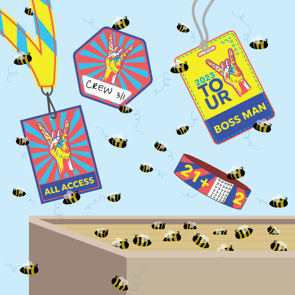
Sure, a big and bright pink installation would be great, but not all of us have the resources for that. Keep it simple yet bold with event badges, hanging parking passes, and lanyards!

Color has much more influence in our lives than we give it credit for, and Pantone knows that. Let’s all live a little through rose – er, magenta – colored glasses this year and spread the joy, strength and vigor that is 2023 by adding at least a pop here and there of Pantone’s Color of the Year, Viva Magenta.


